For mobile design, think lean and mean -- this means stripping out useless clutter, and simplifying. In this tutorial, we will take the simple page we created in the Fast Start tutorial, and modify the layout so that it fits on a mobile layout page. Topics we cover here are:
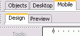
Open your Mobile Layout tab If your Mobile Layout tab is not already showing towards the top left, click the "Layout Options" button at top right of your workpage and select "Dual ".
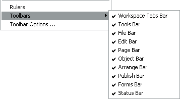
If you don't have any layout tabs showing, use View > Toolbars and check that you have the Workspace Tabs Bar checked as shown below:
Reposition objects in Mobile Layout The aim is to get everything in the mobile layout to appear inside the blue Mobile guide border running down the page. If you don't see a blue guide border, select the "Guide Border" button on the top toolbar.
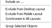
Omit non-essentials Omit images or anything else that is not really necessary. Right click the object concerned and from the context menu, select "Exclude from Mobile Layout".
You might have something you want to appear in Mobile Layout, but not in Desktop Layout. If so, use "Exclude from Desktop Layout" -- this will exclude the object from the Desktop Layout, but not from Design Layout.
Drag and drop Drag everything left so that it starts near to the left edge of the mobile layout
Resize objects Resize objects that spill over the edge of your mobile design width -- the right-hand guide border. Drag-stretch text objects downwards so that all the text displays.
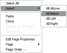
Select All Below In the process of resizing, you will probably find that you need to shift everything below further down the page. To do this, right-click on the page or on the object and from the context menu, Select > All Below. Having done that, you can then move those objects down with the cursor keys, drag with your mouse, or enter a new y coordinate in the Quick Editor > Object tab.
In the process of working down the page like this, you may find you need to make changes in Design view. Having done that, you can synchronize the object changed by leaving it selected, right clicking and selecting "Synchronize All Layouts". This will transfer the change into the mobile layout. If you have more extensive changes, use Select > All Below to select a group of objects, or one of the other multiple select options. Then you can synchronize everything in the group across the layouts.
If you change text in mobile or design views, synchronizing is automatic. A mobile text change will be reflected in Design Layout too.
Preview There are several ways to preview a mobile page, but here is the easiest:
Select the hand-held button at the top left of the preview bar -- this switches the Opera browser into SSR (Small Screen Rendering mode), so that it gives a good indication of what the page will look like in a real mobile.
Select the size of "mobile screen" you require. The above image shows the screen set for 240 pixels wide x 320 high.
Our test page
Our test page is here:
To see the mobile layout workpage, open the page then select the Mobile Layout tab. Click the Preview tab.
As a more complex demonstration, we have set a mobile layout for this page too.