SiteSpinner Pro Tutorials banner
< Tutorials Home
Mobile Development

We suggest you first read the Mobile Introduction tutorial. In this tutorial we consider practical issues in designing for mobiles using SiteSpinner Pro:

Why a mobile version of your pages?
Separate mobile pages vs combined pages
Cascading Style Sheets (CCS) for formatting
Dual media settings
Project Options > General tab
Project Options > Mobile tab
Project Options > Advanced tab
Don't need a Mobile layout, but do need a Printer?
Telephone links
Converting a Desktop design to Mobile


SiteSpinner Pro logo
Mobile page
Why a mobile version of your pages?

Mobiles reformat standard web pages. Opera does the same thing with their Small Screen Rendering (SSR) functionality in their mobile browser, as does the built-in Opera on the Preview tab. The mobile browser looks at the page and if it does not see that the page was created specifically for a mobile device, it reformats the page to fit the screen.

Often, the browsers do a good job, and even if you don't explicitly design for mobiles, you can help them along by keeping your pages simple and clean. Desktop users appreciate pages like this too!

However, the benefit of SiteSpinner Pro is that you can see how your pages will be displayed on a mobile device -- be it a cell phone or PDA -- and then adjust the design for that specific device.

The Apple iPhone tries to display a standard webpage as it would appear on a desktop browser. While this may make it easy for developers who do not want to create custom mobile optimized web pages, these pages can be slow because of graphics, and require that the visitor pan and zoom to find and view content. To get around this, professional sites create pages specifically formatted for the iPhone. A couple of examples are http://m.cnn.com/ and http://www.cbc.ca/iphone.

However not all mobiles are iPhones, and the pan-and-zooml technique does not work so well on smaller screens -- there is just too much panning and zooming.

Regardless of the mobile used, there are many cases where a mobile version of the page will do a better job of displaying your information. For example, if you are waiting or paying for every byte you download, you may want to see what the latest version of SiteSpinner is but you may not want to see the fancy graphics.
Preview tab
Separate mobile pages vs combined pages

The "traditional" way of designing for mobiles is to have separate pages just for them in perhaps a sub-domain of your site. This gives you full control over what goes into those pages.

However, if you also have a desktop version of your site, you will find it a lot more work maintaining two separate versions. You have to make any changes in two different places.

If you want to design your mobile site like that with SiteSpinner Pro, you still can -- select "Mobile Only", from your project options.
The SiteSpinner Pro default mode is "combined" which means that a single page can serve double duty to both desktop and mobile devices. The advantage of this is ease of  maintenance -- you need only one version of your pages, with only a little extra work to convert a desktop design into a mobile one. Combined media contains both Desktop and Mobile layouts and lets the browser choose which one to use.

To change this setting, use the Options > Project Options >General tab.
Site design choices
Cascading Style Sheets (CCS) for formatting

SiteSpinner Pro controls the content and formatting of your pages with CSS. The media type allows you to specify the CSS for a particular device. That means you can use the same images and text but scale or position them differently for different devices.  A browser on a mobile device will use the CSS defined in the  "handheld" media type while a desktop browser will use the CSS defined in the "screen" type. This is the theory -- in practice not all browsers respect the media type. There are a few more media types like "print" , "tv", and "projector" -- which you can also use in your projects.

The Design tab is where you design your pages. The additional tabs, Desktop and Mobile, are where you can scale, position or exclude objects for a particular browser's media type.

In the Desktop and Mobile Layouts, you can adjust one view without affecting the other. In the Design Layout, when you size an object, it will affect both layouts. You can also do things in Design like rotate and skew, that can't be done in the layouts but that nonetheless affect both.

Try this simple example with a rectangle :
The default drag action of Mobile and Desktop is to scale the rectangle. The Design sizes it -- same as traditional SiteSpinner.

Everything you do in Design affects both layouts and anything you do in the layouts will reflect back into the Design. Layouts are independent except for text changes -- edit text in either layout or Design and it changes everywhere.

TM & © 1998 - 2010, Virtual Mechanics, all rights reserved.
Tool: Quick Editor
Dual Media Settings

The "Dual Media View" displays two CSS media type layout view tabs (the defaults are Desktop and Mobile) which let you to select either CSS layout view. They allow you to position, scale, add or delete objects in either view, without changing the other.

If you don't see the Desktop and Mobile tabs on your workpage, set them with one of the following:
If you still don't see them, but instead see tabs with other names, Open Project Options > Advanced and click "Restore Defaults".

Customize media types and queries with the Project Options, Advanced tab, "Layout Tab Definition" area -- this controls the names of the layout tabs.
Dual media -- three tabs
Layout Options
Restore Defaults
Project Options > General tab

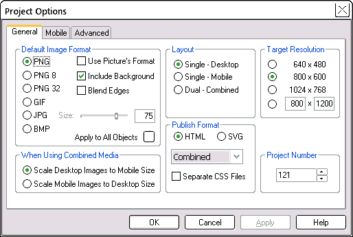
On the main menu Project Options > General tab, shown below, are some settings relating to mobiles.

Scale Desktop Images to Mobile Size
(default) means that the mobile design will be derived from the desktop. For mobile this will be a scale down, but if you substitute another device for a mobile, it could be a scale up.

Scale Mobile Images to Desktop Size
means that the desktop design will be derived from the mobile.

Use Combined if you want to maintain two layouts of whatever type. If you are designing for only one type, say only Desktop, only Mobile or only Printer, select one of the other settings -- Desktop or Mobile Only.


Project Options -- combined media
Site design choices
Project Options > Mobile tab

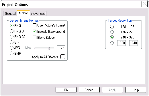
The Mobile tab, shown below, allows you set image formats for Mobile just as you can under the General tab for Desktop.

The target resolution is similar to that for Desktop, (width x height in pixels) including a custom setting for any special size you want. The effect of this setting is to change the placement of the blue guide borders if you have them displayed. If you don't see the blue guide borders on your workpage, select the Guide Border button on the top toolbar.
Guide border button
Project Options -- Mobile tab
Project Options > Advanced tab

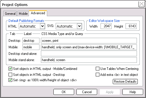
The Advanced tab shown below allows you to give names to your layout tabs, and also to set the Media Type and Query for each layout.

These settings will suit a mobile with a screen width of 320px. 
desktop:  screen and (min-device-width: 321px)
mobile:    handheld, only screen and (max-device-width: 320px)
 
Use "min-width" instead of "min-device-width" to allow you to simulate screen size changes. Min-width uses the browser window size instead of the device screen size. Preview on a desktop browser and draw in the right edge of the browser -- you should see the point where the browser display flicks from using the desktop CSS to the mobile CSS.

For your final published version, don't forget to restore your media query back to normal.

The default settings (if you click "Restore Defaults") will show a mobile max-device-width of [%MOBILE_TARGET_WIDTH+1%]. This is computer-speak to use the target width specified in the Target Resolution section of the Mobile tab. So change the target resolution and max-device-width will follow it.

The iPhone also doesn't use the handheld media type; instead it uses the "screen" media type -- therefore an iPhone will use your desktop design, unless you tell it otherwise with something like this:
desktop:  screen and (min-device-width: 481px)    
mobile:  only screen and (max-device-width: 480px)

Project Options Advanced tab
Don't need a Mobile layout, but do need a Printer?

To change the mobile layout to Printer, change the layout name under "Label" and set the Media type under "CSS Media Type/ and or Query" to be "print" (image below).

You could also make similar substitutions for other media types.
Project Options Advanced tab
Printer setting
Telephone links
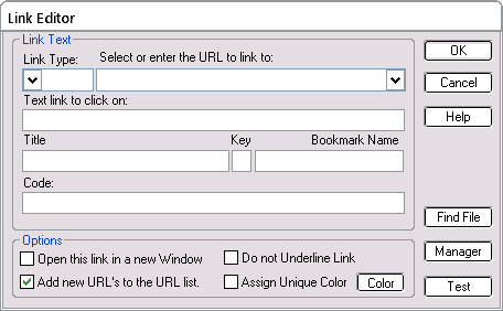
In a mobile, the equivalent of a click on a telephone number link will dial that number. In SiteSpinner, entering telephone numbers as links requires setting a blank link type. In the Text Editor:
        Link type: blank
        Link URL : tel: 1-408-555-5555  (substitute your actual phone number).

Link Editor -- telephone number
The result is this: 1-408-555-5555
Converting a Desktop design to Mobile

In summary, these are the steps you should take to create a combined Desktop and Mobile page:

1. Design a regular page
First built a regular web page, using the Desktop and Design tabs. As we have discussed previously, mobiles can do a reasonable job of regular web pages. But to make it look better on mobiles:

2. Synchronize all layouts
In the Desktop and Design tabs, use CTRL+A to select All, right click and select "Synchronize in All Layouts" -- this will get all objects into both layouts (if not already there) and ensure that any layout changes that you have made in Desktop will also appear in the other layouts.

Synchronize layouts

3. Drag and rescale
In Mobile layout, drag the edges of each object to rescale them so that they fit within your mobile blue guide borders. To help shift everything below where you are working down the page, right click the page or an object and use "Select All Below". To maintain the aspect ratio of an image as you scale it, hold down the Alt key while you drag an edge.

4. Add and exclude
Add the extra objects that you want for Mobile and remove the objects that you don't. If you add a new object to the Mobile layout, it will appear in Design, but not on the Desktop. If you right-click an object, the context menu has options to exclude items from the layout, or to include items on all layouts: the Synchronize option. You can apply these to single objects or multiple objects -- just select more than one object.

5. Preview
To preview your mobile page, use the built-in Opera small screen Mode.


Preview tab
Opera preview toolbar

See also these other tutorial pages:
Mobile Design Introduction
Previews
Fast Start -- Mobiles

Tutorials banner