 in the Components Bar.
Use the Table Editor dialog box to set all of the properties of a table, including table dimensions, border size and color, background color, and cell border, padding, spacing, and alignment.
To open the Table Editor dialog box, select
Object>Table, or click the Table button: in the Components Bar.
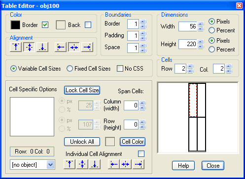
Use the Table Editor dialog box to set table and cell properties.
When you add contents to a table such as text or image objects, the objects become embedded in the table. This means, for example, that when you click and drag a table object to move it on the page, any added text or other objects move along with it.
To add more than one object to a cell, make a permanent group out of the objects first.
To edit the contents of a cell right-click on the cell and select the appropriate edit function (e.g., Edit Text, Edit Geometry etc).
To keep an object from breaking free from a table when you’re clicking and dragging to move the table, hold the ALT key while you drag. Similarly, to keep an object from becoming part of a table when you are moving it on the page, press and hold the ALT key while you are dragging it.
A unique feature of the Table Editor is the Dynamic Layout Window, which not only displays a thumbnail view of the table and its properties but also allows you to double-click any object in the table to open its associated editor.
Options on the Table Editor dialog box include the following:
| Field/Control | Description |
| Border | Click to checkmark to open the Color dialog box to assign a color to the table borders. The default color is black, and the default for table backgrounds is no color. For more information, see Color Dialog Box. |
| Back | Click to checkmark to open the Color dialog box to assign a color to the table background. The default is no color (i.e., is transparent). |
| Vertical Alignment | Click one of the three buttons (Top Alignment, Center Vertical Alignment, or Bottom Alignment) to set vertical alignment for all objects in the table. |
| Horizontal Alignment | Click one of the three buttons (Left Alignment, Center Horizontal Alignment, or Right Alignment) to set horizontal alignment for all objects in the table. |
| Border | Use the spinner to increase or reduce the width in pixels of the table border. Or, you may enter a pixel value in the field. The default setting is 1. |
| Padding | Padding is the space between the cell’s border and the object’s border. Use the spinner to increase or reduce the size in pixels of the cell padding. Or, you may enter a pixel value in the field. The default setting is 1. |
| Space | Space in the space between one cell border and the next Use the spinner to increase or reduce the space in pixels of cell borders. Or, you may enter a pixel value in the field. The default setting is 1. |
| Width | Use the spinner to increase or reduce the width of the table in pixels. Or, you may enter a pixel value in the field. The default setting is 20. An HTML Table’s cell cannot be less that 5 pixels wide. So the table width cannot be less than the number of cells multiplied by 5 plus the spacing, padding, and border widths. Click the Pixel radio button to set the width in pixels, or click the Percent radio button to set the width of the table to be a percentage of the browser window size. |
| Height | Use the spinner to increase or reduce the height of the table in pixels. Or, you may enter a pixel value in the field. The default setting is 50. An HTML Table’s cell cannot be less that 20 pixels high. So the table height cannot be less than the number of cells multiplied by 5 plus the spacing, padding, and border widths. Click the Pixel radio button to set the height in pixels, or click the Percent radio button to set the height of the table to be a percentage of the browser window size. |
| Variable Cell Sizes | Click the radio button to adjust the height and width of table cells to fit the size of any objects placed in them. |
| Fixed Cell Sizes | Click the radio button to fix the size of table cells regardless of the size of any objects placed in them. This setting will automatically scale down any image objects but will truncate large quantities of text in text objects. |
| No CSS | Click to checkmark to turn off absolute positioning of the table. |
| Row | Use the spinner to increase or reduce the number of rows in the table. Or, you may enter a pixel value in the field. The default setting is 2. The minimum is 1; the maximum is 99. |
| Col. | Use the spinner to increase or reduce the number of columns in the table. Or, you may enter a pixel value in the field. The default setting is 2. The minimum is 1; the maximum is 99. |
| Thumbnail Window | Displays the object, if any, that occupies the currently selected cell. |
| Object Selection | Select from the drop-down menu any object in the project to insert into the cell that appears highlighted in red in the Dynamic Layout Window. The selected object will display in the Thumbnail Window. |
| Lock Cell Size | Click to toggle on or off the ability to set the individual
width and height of a selected cell in the table.
Use the top spinner to increase or reduce the width of the selected cell, or enter a value in the field. Click the px radio button to set the width in pixels, or click the % radio button to set the width as a percentage of the table. Use the bottom spinner to increase or reduce the height of the selected cell, or enter a value in the field. Click the px radio button to set the height in pixels, or click the % radio button to set the height as a percentage of the table. |
| Span Cells | Use the Column spinner to select the number of columns the
selected cell will span toward the right, or enter a value in the field.
This has the effect of deleting columns in the row of the selected cell
as the selected cell spans those cell positions.
Use the Row spinner to select the number of rows the selected cell will span toward the bottom, or enter a value in the field. This has the effect of deleting rows in the column of the selected cell as the selected cell spans those cell positions. |
| Unlock All | Click to disable the ability to set the individual size of all cells in the table. |
| Color | Click to open the Color dialog box to set a custom color to apply to the selected cell. The color you select will display in the small box to the left. (You may also click this box to open the Color dialog box.) |
| Individual Cell Alignment | Click to checkmark to activate alignment of any object in the selected cell. Click one in the set of three buttons to the left (Top Alignment, Center Vertical Alignment, or Bottom Alignment) to set vertical alignment for the object. Click one in the set of three buttons to the right (Top Alignment, Center Horizontal Alignment, or Bottom Alignment) to set horizontal alignment for the object. |
| If the Individual Cell Alignment option is not selected (checkmarked), then vertical and horizontal alignment settings for the entire table will be applied to the selected cell. | |
| Dynamic Layout Window | Displays the currently selected table object. You may select an individual cell for editing by clicking it in the window; a dotted red border will appear around the selected cell. In cells that contain a text, image, or foreign/media object, you can open the editor associated with the object by double-clicking the cell in the window. You can also drag a cell from one location to another to move, copy, insert, swap, or span the source and destination cells and their contents. |
| Help | Click to open a context-sensitive help topic. |
| Cancel | Click to close the dialog box. |

