
How to access form objects
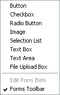
Access the form objects from the main menu Object > Forms. The sub-menu has a list of all the objects available and also a checkbox for the Forms Toolbar, which is shown checked on the right.
With the box checked, you should get the following extra toolbar appearing at the bottom of your workpage:
On the main Menu View > Toolbar Options ... you have the option to set bigger buttons. See Workpage tutorial: Toolbars.
Below we look at each form object, concentrating on the most important controls.
Getting started with forms
Let's start on forms by adding a simple button to your page. Click the Form Button button, then click your page where you want the button to be placed. Drag the edges to make it bigger or smaller.
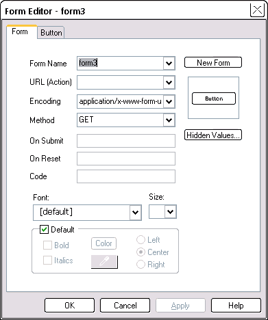
Double-click the new button you just placed -- this opens the Form Editor. All form objects belong to a form. When you place a form object on your page, the property sheet has two tabs, one for the parent form and one for the object itself -- which is just another object.
It's good practice to give forms a meaningful name. We will rename ours to formIntro from the default form3 you see in the property sheet to the right.
To edit an object's properties you can also select the object, then click the Edit Form component on the bottom toolbar -- this will be enabled (not grayed out) when you have a form object selected.

URL (Action)
This field specifies the URL of a script that will do something with the form data. This can also be an e-mail address. However, the e-mail programs that people use are very variable, and there is no guarantee that they will pick up the form data correctly, or even send it! So we don't recommend using an e-mail address, however tempting that might be.
Typically the URL(Action) field will be a relative path to a file on your own server. You are then relying on your server to do something sensible with the data -- see form mail scripts.
You can also place some Javascript code in this field to instead perform some other operation. For instance, the password protection example of the Using Forms tutorial.
The Encoding type determines how the form data is encoded for transmission from your visitor to your server. So long as both ends can agree, we don't need to worry too much about it. However some encoding types are better suited for some circumstances:
- application/x-www-form-urlencoded: most widely supported. Use it most times
- multipart/form-data: use when uploading files
- text/plain: use when the Action attribute points to a mailto URL.
There are two Methods to send form data to a server:
- GET the default, will send the form input appended to the URL and separated by a question mark (?). If you look at the url in your browser after doing a Google search, you will see the ? and data which represents the search details. Use this method for simple database queries.
- POST sends the data in the body of the submission. This means you can send larger amounts of data, and that the URL for the form results doesn't show the encoded form. Use this method where the submission might (eventually!) change a database, or send Email.
On Submit: may point at a Javascript function to do something just before the form is sent off. Typically, this will be validation -- make sure there are no obvious errors in the form data. If you can catch errors here, it is quicker to correct them. Here, we have used the OnSubmit event to advise you, in preview, that data from this form is going nowhere useful.
On Reset: may point at a Javascript function that does something before resetting all fields on the form to their starting values. For a big form, just an "are you sure?" message can be helpful. We have used a message like that on this form.
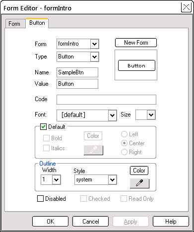
Selecting the Button tab for our button, what we see is on the right:
The Form is the name of the parent form -- all form objects must have one.
The Type is a button here, but if you decide it should be something else, select it from the drop-down list box. You won't lose all the data you may have already entered for the object.
All form objects have a Name and Value.
Name
It is useful to give each form object a meaningful new name. This name will appear when you submit the form, or may be accessed by code.
Value
The value is variable. It can be the name of a button, or the data in a text box.

Use the Code field for any extra code. One common item is to add an "onClick" event -- requesting some function when the object is clicked. Another is to apply a CSS style.
When you leave the Default font checked, the font used will be that set via the Page Editor > Links, Fonts tab > Default Font. We used Verdana 10 pt for these tutorials, so if your default font is much larger than that, you may find your text is too large to fit in some of the form obects.
In the drop-down Font list, notice the green "WS" against some of the font types. These denote the fonts that are web-safe -- we suggest you stick to those.
The controls towards the bottom of the tab allow you to give a variety of treatments to the edges of the object -- they are grayed out when not applicable.
The Color setting controls the color of the outline, not the color of the body of the object.
Style Examples
The buttons below show some of the treatments you can apply to all form objects. They show each of the possible styles available in the drop-down Outline Style box, and have an outline Width of 5 pixels. Two of the styles, System and None, do not allow you to change the outline width or color.


These are the attributes you can change from the Form Editor:
- outline (border) Color (also in the Quick Editor > Outline tab)
- outline Style
- outline Width (also in the Quick Editor > Outline tab)
- foreground color (font Color)
- font type, style and size
The background color of the main body of form objects, which we have also changed in the examples, is not available in the Form Editor, but is available on the Quick Editor > Shading tab. You can use a textured shading as shown by the ridge style button -- preview to see the effect.
The exact effect you see is somewhat determined by the browser you are using.


Create a new form
If you add a new form object, it will be added to the current form. To create a new form for an added object:
- Click the New Form button (top right of the Form Editor)
- Select the new form from the drop-down list
- Give the new form a proper name (recommended)
To switch objects to another existing (not new) form: with the object selected, select the existing form from the drop-down Form list. This does not move the location of the form object -- it just changes its parent.
Let's now look at each of the form objects that are available.
Button
Buttons hardly need further explanation! See Getting started with forms.

There are two special kinds of buttons (selected by the drop-down list Type on the Button tab):
Submit results in the form data being sent to the URL in the form URL (Action). Often there may be some Javascript validating the form to make sure all the required fields are filled out and have at least half-way sensible values in them. Do this in the On submit event of the form, available on the button Form tab. In preview, try the button just above.
Reset sets all data on the form back to its starting condition. For a large form, this is a dangerous command because clicked accidentally, your visitor would lose all their input data. Common workarounds are to use the On Reset event of the form, also available on the Form tab, to restrict its action, or at the very least, present an "are you sure?" message. In preview, try the Reset button just above.
Checkbox
Checkboxes have two states -- they can be either checked or unchecked. Compared to radio buttons they are independent of each other. The starting Checked state is at the bottom of the Checkbox tab on the property sheet.
Radio button
Radio buttons also have two states -- they can be either checked (selected) or unchecked. But only one radio button of a group can be checked at any one time -- and you should have at least two buttons in the group. You can see this operation in preview. Control which buttons are in a group by setting their Name property. Buttons with the same Name will interact with each other. Those with a different name (in a different group) will be independent.
Image
An image can act much the same as a button. Use the image button to select the location of the image to display. You can resize the image just like any other image.
If you have assigned a URL (Action) to the form, clicking the image will cause the form details to be sent to the URL. This is the same action as for the Submit button.
The image can be anything you like -- we've chosen an image that from the ClipArt folder. To the basic image, we added a border of 3 pixels with a style of double, both set in the Form Editor for the image.
You can also set the border thickness and color from the Quick Editor, but not the style -- you can do that only from the Form Editor.
The default state for the image is Anti-Alias and Re-Render both on. Where you are reusing an existing image, you should turn these both off and avoid creating an extra unnecessary image. These settings are in the Quick Editor > Object tab.
Selection list
A Selection List has a list of Names and against them a list of Values. You as the form designer fill out these values -- not your visitor. You present a list of choices, the Names, to your visitor and they will select one or more depending on how you set it up.
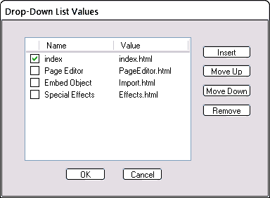
If you click the Values button of the Selection List tab, you will get a dialog box like the following. The checkboxes determine the entries that will show as selected (highlighted) when the list box opens. For a drop-down list box, it makes sense to check only one entry. That's all your visitor can select at one time!
Check Multiple to allow multiple selections -- two or more items to be selected at one time.

The Name column contains the entries that will appear when published (or in preview).
The Value column is the corresponding value you want to be used when your visitor selects an item. In preview, the selection lists here will show only the Names potentially available -- if you want something more to happen, see menus with selection lists which use the Values to jump to other pages.
As a visitor, select multiple items the same way as in Windows Explorer if you are dragging and dropping files from one folder to another:
- To select the first item click on it
- To select the second and subsequent hold down Ctrl and click
- To select a range, hold down Shift and click a second item.
All selected items will show highlighted.
Text box
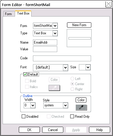
A text box allows your visitor to enter and edit one line of text. The text will scroll horizontally if it is too wide to fit in the box. You can mark the box Read Only if you don't want your visitor to edit the text already here. The Value field sets the initial text.
Password box
This is just a text box, where the entered text is masked off by blobs so that you or anyone snooping over your shoulder can't read it. Again the Value field sets the initial text entry. Create it as for a text box, and then select a Type of Password.
Text area
A text area allows your visitor to enter and edit more than one line of text. It is like a big text box except the scrolling is vertical.
File upload
The File Upload box allows your visitor to browse and select a file name and have that file uploaded along with the form details. For this to work, you need to have the Form Encoding to be set to multipart/form-data.
The left hand part of the box, the bit that holds the file name is normally closed up. Drag it out to the left to make a good-sized space. The file name will appear in the box after your visitor has browsed to the file name.
Form edit
When you have a form object selected (e.g. by clicking on it) the Form edit button will become enabled. Clicking it will allow you to edit that form object. You can also select the object by double-clicking it.
Default font for forms
If you intend to use the same font throughout your forms (a good idea!), consider setting it up in the Page Editor > Links, Fonts tab. This font will then be used whenever you leave the font at [default] in a form object.

Grouping form objects into a new form
The form items we have looked at here may not look like they are on a form, but they are nonetheless. They all belong to a form called formIntro. If you look at the finished code, you will see them all grouped together near the top.
To put form objects into the same form, select all the objects and make a permanent group. If the objects are currently in different forms, you will be prompted to create a new form for those objects. After that, you can un-group.
Control the tab order -- z-order
One common way to navigate around the fields of a finished form is to use the Tab key. Pressing Tab moves the cursor on to the next field. It helps if the tabbing is in a logical sequence!
To re-order the objects into tab order (or z-order), select the objects, one at a time, in the order you want them to appear, and press the "to front" button for each one. So, select the first object, press "to front", select the second object, press "to front" and so on.
Control the tab order -- tabindex
Another way to control the tab order is by using the Code field of each form object (the second tab) and adding the code:
tabindex=N
where N is the tab number (starting at 1) to be assigned to that object (image below).
The tab key will then move the cursor to the next numbered object, regardless of the z-order within the form.


Problems with Forms
1. You click your Submit button and nothing happens. A Submit button looks exactly the same as a regular button. Make sure your submit button has a type of "Submit" -- select the type in the drop-down list box on the Button tab headed "Type". This means that when clicked, the button will submit the form data to your host.
2. Forgetting that form object names are case-sensitive. A field called "Email" is not the same as one called "email". If a script on your host is looking for a field called "Email" but your form sends it one called "email", your host will not accept that data.
3. Two or more objects with the same name. The default action of SiteSpinner is to give all form objects a unique, but boring name -- formxx. If you are renaming your form objects, make sure you give each a unique name. Exception: radio buttons of a group all have the same name.
4. Where your form relies on a script, not uploading the script to your host. See Form Mail: Upload the script file.
5. Your submit button works, but doesn't submit all the data you expect. Make sure all your form objects belong to the same form.
See also:
Using Forms tutorial
Form Mail Scripts


