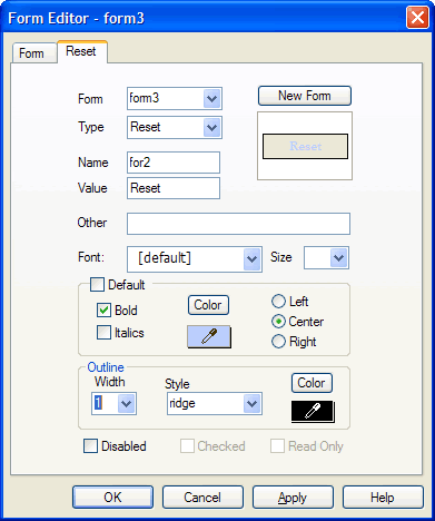
Use the Form Item tab of the Form Editor dialog box to set the properties of a selected form input field.
The name of the Form Item tab changes dynamically depending on the currently selected input field. For example if a button input object is selected, the Form Item tab becomes the Button tab, if a file upload input object is selected, the Form Item tab becomes the File Browse tab, etc.

Specify a form input field's properties using the Form Item tab of the Form Editor dialog box.
Controls on the Form Item Tab of the Form Editor dialog box include the following:
| Field/Control | Description |
| Form | Displays the name of the currently selected form. To work with a different form in the project, select its name from the dropdown menu. You may rename a selected form by overwriting its highlighted name in this field. |
| Type | Displays the input type of the currently selected form field. You can change the input type by selecting a different input type from the dropdown menu. |
| Name | Displays the name of the currently selected form input. You can rename the form input by overwriting its highlighted name in this field. |
| Value | The Value attribute
serves multiple uses. For button, checkbox, and radio button inputs, the
value is what is passed to the server when the form is submitted.
For text inputs (text boxes and text areas), if desired, enter a value to be preset in the input field. This is most commonly used either to save your users from entering information or to prompt them for the type of information to enter in the input field. For example, you may went to include a value such as “Enter comments here” in a text area input. Frequently, however, you will want to clear the Value field. |
| Other | If desired, enter code to provide additional functionality (i.e. “OnClick=[something]”) to the input action. |
| Font |
Select a font from the dropdown menu to apply to the text label of the selected input field. Or, accept the [default] selection. |
|
Be aware that because different browsers
may interpret fonts differently, fonts and form inputs may not appear
as you intended. To assist you we recommend using
fonts that are "web safe." Web-safe fonts appear in the dropdown
menu with the |
|
|
Size |
Select from the dropdown menu a font size to apply to the text labels of the selected input field. |
| Default |
Click to checkmark to accept default text label characteristics for the selected form input. Or, click to uncheckmark to enable controls for text label characteristics. |
| Bold |
Disabled when Default option box is uncheckmarked. Click to apply a boldface effect to the text label of the selected input field. |
| Italic |
Disabled when Default option box is uncheckmarked. Click to italicize the text label of the selected input field. |
| Color |
Disabled when Default option box is uncheckmarked. Click to open the Color dialog box that allows you to select a system or custom color to apply to the text label of the selected form input. |
 |
Disabled when Default option box is uncheckmarked. Click and drag to use the color dropper tool to pick up a color anywhere on your computer screen. Release the mouse button, and the control will display the selected color. The text label in the selected form input will then bear the selected color. |
| Align | Disabled when Default option box is uncheckmarked. Click the Left radio button to globally align text labels along the left margins of the form inputs; click the Center radio button to globally center the text labels of the form inputs, or click the Right radio button to globally align text labels along the right margins of the form inputs. |
| Width | Not available for checkbox or radio button inputs. Select from the dropdown menu the pixel width of a border to apply around the input field. The default value is “0” (no border). |
| Style | Not available for checkbox or radio button inputs. Select from the dropdown menu the border style of a border to apply around the input field. The default value is “system.” |
|
|
Not available for checkbox or radio button inputs. Click to open the Color dialog box that allows you to select a system or custom color to apply to the border of the selected form input. |
|
|
Not available for checkbox or radio button inputs. Click and drag to use the color dropper tool to pick up a color anywhere on your computer screen. Release the mouse button, and the control will display the selected color. The border of the selected form input will then bear the selected color. |
|
Disabled |
Click to set the selected form input as disabled (unselectable). |
| Checked | Available only for checkbox, radio button, and file upload form inputs. Click to preset the selected form input as active (enabled) by default. |
| Read Only | Available only with Text Box, Password, Text Area, and File Upload inputs. Click to disallow users from entering text in the field. |
| Multiple | Available only when a selection list input is selected. Click to checkmark to allow users to select more than one option from the selection list by pressing the CTRL key while clicking. |
| Drop Down List | Available only when a selection list input is selected. Click to make the selection list a dropdown menu. |
| New Form | Click to create a new form object. You will be prompted to save the current form. The new form object will retain the properties settings of the previous form object. |
| Values | Available only when a selection list input is selected. |
| Image | Available only when image input is selected. Click to display the Open dialog box to browse for image files to apply to the image input. |
| OK | Click to accept the current settings and exit the dialog box. |
| Cancel | Click to cancel the operation and close the dialog box. |
| Apply | Click to accept the current settings without exiting the dialog box. |
| Help | Click to open a context-sensitive help topic. |