
|
3 Ways To Make Your Website Mobile-Friendly (and why you need to)
Google is set to reduce search rankings for non mobile-friendly pages. Is your website mobile ready?
Over 50% of all web searches are now done from a mobile device. Chances are most people today are searching for, and then viewing your website on a mobile device of some kind.

Make no mistake about it, your audience will expect to be able to view your website on their mobile device. If they have to scroll or zoom or pan to view your web page, they will most likely simply leave.
So, if over 50% of people are visiting your site from a mobile device, and your page is difficult to view, you risk loosing over 50% of your visitors.
You need to ask yourself, are you feeling lucky? Are you getting so many visitors now that you can afford to loose half of them?
Google is set to penalize non-mobile-friendly web pages
With so many of us searching and viewing the web from our mobile devices it comes as no surprise that Google announced that on April 21'st they will lower the search rankings for web pages that do not meet Google's standards for mobile-friendliness.
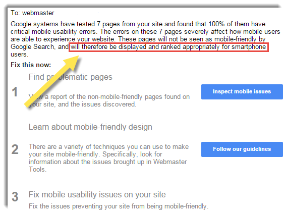
For example, lets say your web page came up on the first page of a Google search. After April 21st, If your web page does not pass muster with Google, your page may no longer rank on the first page if someone does a search for the same term on a mobile device.
So what can you do?
First you have to decide if you care, but that is another question that I will answer further down in this post.
But if you do care (and I think you should), then the first thing to do is to determine if Google thinks your web page is mobile friendly or not.
Test Your Web Page For Mobile Compliance
Google's
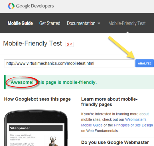
Mobile Friendly Test Tool will check your web page for compliance with Google's standards for mobile pages.
All you need to do is enter the URL of the page you want to test into the tool, press the Analyze button, and Google will let you know if your page passes or not.
You should also know that there is a fare amount of controversy over whether this tool is really a good test of what constitutes a good mobile web page...
At the end of the day though, Google controls search results. So if you want to rank well on mobile devices, we all have to follow Google's rules.
If your web page passed, congratulations. Or as Google says, 'Awesome'!
Now, you could simply go off and watch something dumb on TV, because at least you know your web page won't be penalized by Google.
However, if you really want to get a sense as to what visitors to your web page will see if they view it on their mobile devices, Google Chrome has a nifty, built-in feature that lets you see what your web page looks like on a whole slew of different phones and tablets and e-readers.
See What Your Web Page Looks Like On Different Devices
Follow these steps.
- Open Google Chrome, and visit the page you want to check (for our demonstration you can visit our mobile test page)
- Press Ctrl+Shift+I on your keyboard. This will open up Chrome's Developer Tools
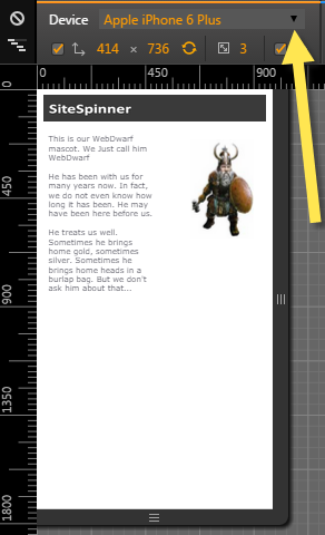 A window will open where you can see what the web page looks like on different devices (in the image on the left I am viewing our test page on an iPhone 6). A window will open where you can see what the web page looks like on different devices (in the image on the left I am viewing our test page on an iPhone 6).
You can use the drop-down at the top of the page to select just about any mobile device you would want.
You can also see what the page will look like on Portrait and on Landscape.
So now you know that your page passed Google's Mobile Page test, and you know your page looks awesome on all devices, great!
Perhaps now you can defiantly go watch some dumb TV.
But Wait...
What do you do if :
a) your web page does not pass Google's Mobile Friendly test, or
b) what do you do if the page does not look good in the Google Mobile Devices Preview tests?
This is where we get into the title of this post.
Options for Creating Mobile Friendly Web Pages
Not to worry, making your web pages mobile-friendly is possible. And there are a few options to do it...
Option #1: Create a Standard Web Page
It is possible create a standard web page and have it pass Google's tests. It might not look fantastic across all devices, but it is the simplest way to go.
- Keep the pages simple
- Keep the text large
- keep a distance between links
- keep images and other media to a minimum
A simple header, with simple text. That is all you need. And really, what else do you want when viewing a page on a small screen?
Moreover, lots of white space in design has been shown to lead to more visitor engagement and better conversion for ecommerce sites. Minimalism also happens to be the trend these days.
Simple, clean website are easy to build in both SiteSpinner and SiteSpinner Pro and will pass Google's Mobile Friendly test if you follow the above steps.
Option #2: Create Multi-Layout Web Pages
A multi-layout page is a web page that contains more than one design.
You create a web page specifically designed to look good on a desktop. And then you create a differently layout that is designed to look good on a different device, such as a smart phone, tablet, or both.
The advantage of this is you know exactly what the visitor is going to get.
In fact, you could create a completely different design for desktop devices than for mobile devices. You could build a page for desktop that talks about how much you love vintage movies, and one for mobile that gives directions to your video rental store. Depending on the device your visitor is using, they will get one page or the other.
SiteSpinner Pro has the ability to create Dual Layout pages. So you can design a layout for desktop browsers, and another layout for mobile devices.
The trick, once again, is to keep the mobile layout simple and clean.
Option #3: Create a Responsive Design Web Page
Responsive Website Design is all the buzz in website design circles these days. In a nutshell, a responsive website adjusts its layout to accommodate the device that the page is being viewed on.
If you have two objects on a page side by side, then the size, or the layout of the objects will change, depending on what device is viewing the page.
There a number of tools on the market that can create responsive sites. But due to the complexity of creating fully responsive sites, most responsive pages are either hand coded or template based.
SiteSpinner Pro can create simple Responsive web pages. Using horizontal and vertical positioning and sizing, objects can be set to scale to fit the device the page is being viewed on.
Objects in SiteSpinner Pro cannot be set to reposition themselves vertically. However, if objects are placed side by side, they will adjust to fit the device being viewed.
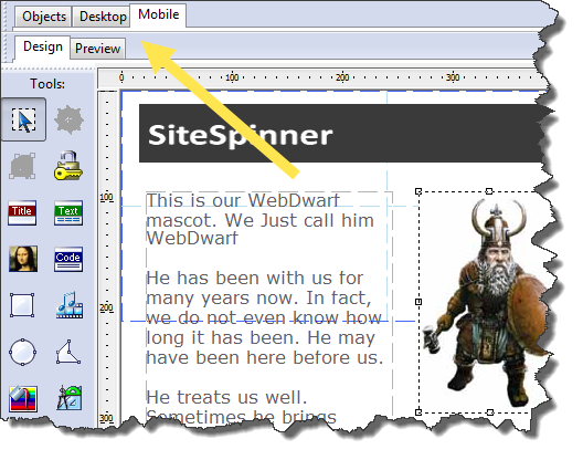
We use SiteSpinner Pro to create a Dual Layout site. In Desktop design we will create a standard web page, and then use Mobile Layout to create a simple, Responsive design.
This mobile test page is an example of a page created with SiteSpinner Pro that uses Dual Layout and simple Responsive design. The Desktop layout is a static page. The Mobile layout uses simple responsive design. The objects on the page adjust their position and size to fit the mobile device.
Conclusion
Finally, keep in mind that not every page on your website has to pass Google's test. Which pages are ranking well, and bring you traffic? Those should be your priority for mobile friendly design.
Remember:
- Over 50% of Google search is now done from a mobile device
- Google is now penalizing web pages that are not mobile-optimized
- There are ways to check what Google thinks of your web page, and ways to see what your web page looks like on mobile devices
- There is more than one way to create a mobile-friendly web page
J. Peter White,
SiteSpinner
www.virtualmechanics.com
www.facebook.com/SiteSpinner
|
|
 |
|

|

